Financial Services / Anonymized A+H-listed Tier 1 securities firm's market analysis team
Macro Analysis Report: Turning Market Inputs Into Traceable Judgement
Internal reports, market news, and macro data arrived on different schedules, making manual report production hard to keep consistent, comparable, and traceable.
The project used a data-release-calendar schedule, separated data preparation, policy signal scoring, insight summarization, and report generation, and constrained the final output with a structured format.
Report and news parsing -> data and topic storage -> policy signal scoring and smoothing -> indicator-level summaries -> structured macro analysis report.
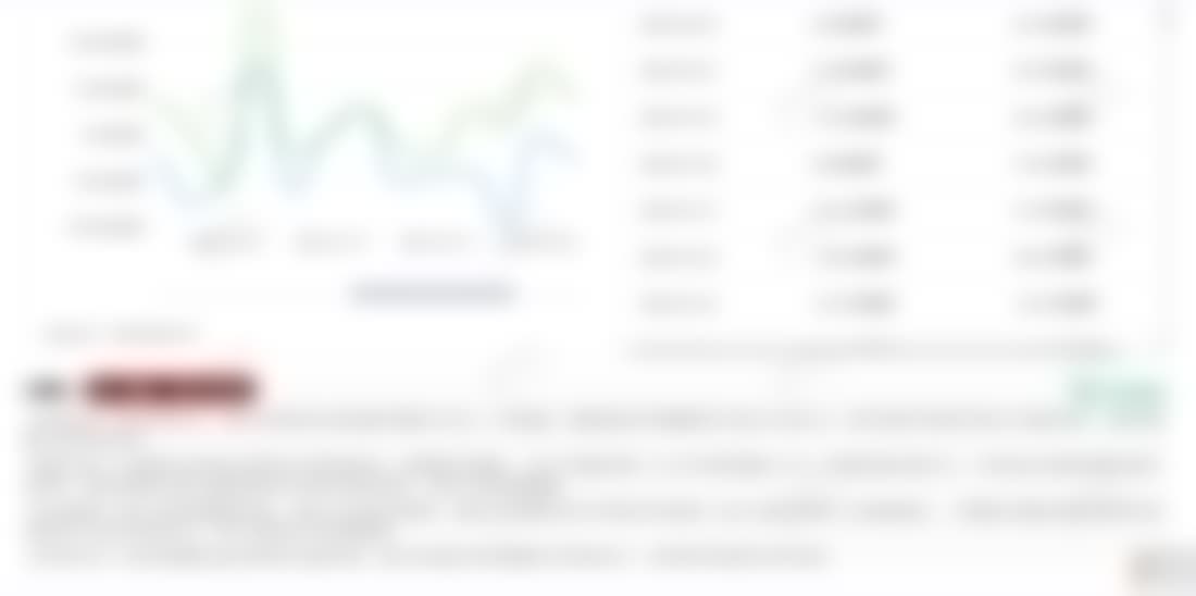
The full pipeline runs nightly in about 00:30–05:00 with the report ready before 5 a.m., covering 23+ macro indicators (~14 domestic activity indicators and ~9 U.S. macro indicators); daily volume converges from thousands of news insights to about a hundred indicator-level insights and one fixed-structure report, with policy direction kept as a traceable time series back to source material.
A useful macro analysis report does not simply restate the day’s material; it turns noisy inputs, uneven data schedules, and policy language into judgement that people can trace.
Background
This project supported an internal market analysis workflow at a financial services institution. The team needed a regular view of market news, macro releases, policy signals, and research reports, then had to turn those inputs into material that could support internal business discussions.
The hard part was not a lack of information. There was too much of it, and it behaved differently depending on the source. Internal reports arrived as PDFs, news moved continuously, macro indicators followed monthly or quarterly release cycles, and policy language often left room for interpretation. A simple “summarize today’s material” prompt would produce fluent text, but the structure and judgement would drift over time.
What Made It Difficult
Macro signals are not clean votes. A day can contain many views pointing in different directions, and a mild comment should not carry the same weight as a rare policy signal. At the same time, the output cannot swing sharply whenever a headline changes wording. The policy view needs some inertia.
Scheduling was another important constraint. Some data should only be reprocessed when a release is expected or when new material arrives. Running every indicator every day would waste model calls and encourage stale explanations. The final report also needed a stable shape: for each major view, readers should see supporting evidence, opposing evidence, and a careful recommendation instead of a one-sided narrative.
My Role
I worked on the pipeline design and helped build several core parts of the workflow. The main boundary was to keep data preparation, policy scoring, insight summarization, and report generation as separate stages instead of letting one prompt handle everything.
The preparation stage converted reports and news into searchable, traceable material with source metadata, dates, topic labels, and original text snippets. The policy signal stage extracted directional signals from relevant material, aggregated them, and smoothed the result so that daily noise did not dominate the view. The summarization stage merged multiple observations about the same indicator into a more stable insight, while making consensus and disagreement explicit. The final report read from these structured intermediate outputs rather than generating freely from raw documents.

Design Choices
The pipeline followed a data release calendar instead of blindly rerunning every macro indicator. This matched the way macro data actually changes and reduced meaningless generation. Higher-frequency news and policy material still went through regular scanning, but the report consumed aggregated signals rather than raw headlines.
Policy temperature was not exposed as an exact public score. Internally, a score can help with sorting, comparison, and trend tracking. For readers, qualitative language such as easing, neutral, or tightening is safer. A numeric value can look more precise than the underlying policy language really is.
The report generator used a constrained structure. That reduced stylistic freedom, but it made the daily output easier to compare. Readers could consistently find the data basis, policy direction, main disagreements, and business implication. For this kind of work, a stable format matters more than polished prose.
Result
The resulting workflow turned macro report preparation into a scheduled, traceable, and reviewable process. The full pipeline runs nightly in roughly 00:30–05:00 with the report ready before 5 a.m., covering 23+ macro indicators (~14 domestic activity indicators and ~9 U.S. macro indicators); daily volume converges from thousands of news insights to about a hundred indicator-level insights and one fixed-structure report. It did not replace business judgement. It compressed the repetitive preparation work so people could spend more time interpreting disagreements, checking marginal changes, and deciding whether a recommendation was worth using.
My main takeaway from this case is that generation quality in financial reporting depends less on making the model write more and more on preventing it from writing loosely. Scheduling, source metadata, scoring boundaries, smoothing, summarization, and structured output are the parts that make a generated report usable beyond a demo.
Related Links
If you are evaluating an enterprise RAG, knowledge base, AI support, or agent workflow project, contact me by email at contact@aildnc.com. You can also reach me on Telegram at @NieErAI.
Contact
Discuss Similar Work
If you are evaluating a similar document AI, enterprise RAG, knowledge base, or AI workflow project, share the context first. Email works, and Telegram is available for a faster reply: contact@aildnc.com.